Creating images with the correct aspect ratio is crucial, whether you’re designing for specific screens, apps, or various formats such as photographs, art prints, and book covers. You’ll be disappointed and frustrated if you don’t allow the proper space for MidJourney to create your images. When you use the correct aspect ratios for your intended project, things go smoother.
This guide will provide the standard aspect ratios you’ll need to help you master a wide range of images and designs in MidJourney. I hope it’s helpful!
What are Aspect Ratios?
Aspect ratios are the proportional relationship between an image’s width and height. They’re typically expressed as two numbers separated by a colon, like 16:9. The first represents the width, and the second represents the height.
Using Aspect Ratios in MidJourney
MidJourney aspect ratios work the same way. In MidJourney version 5.2+, you can use any whole number aspect ratio you want without limits.
Add this parameter to your MidJourney prompt to set the aspect ratio:
--ar 16:9
Some of the aspect ratios listed below are not whole numbers, and MidJourney will give you an error message when using them.

For example, horizontal Instagram images are 1.91:1. In these cases, round to the nearest whole number and then resize in your favorite graphic design program.
In some cases the social media platform will automatically resize your design, and it’ll be close enough the way it is!
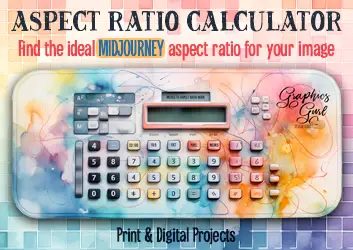
Aspect Ratio Calculator
Need help figuring out the best aspect ratio for your project? Use my free MidJourney aspect ratio calculator:
Optimal Aspect Ratios for Different Screens
Computer Monitors and TVs
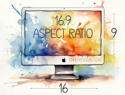
The most common aspect ratio for computer monitors and TVs is 16:9. This widescreen format is also used for most YouTube videos.
However, when developing website design layouts in MidJourney, I use 4:7 to give it enough room to create a complete website design instead of only the top of the webpage; I make it longer.
Smartphones
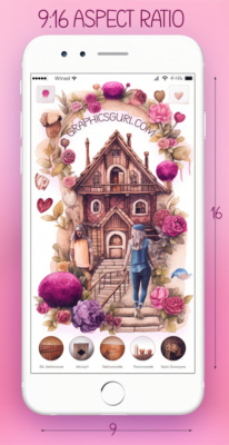
Smartphones typically have a 9:16 aspect ratio when held vertically; the 16:9 ratio is flipped. However, when held horizontally for videos or games, smartphones use a 16:9 aspect ratio.
MidJourney Aspect Ratios for Social Media Apps
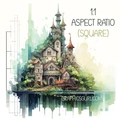
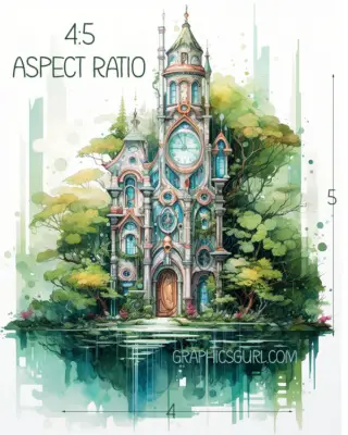
Instagram supports a variety of aspect ratios. For square posts, the aspect ratio is 1:1. For horizontal (landscape) posts, it’s 1.91:1, and for vertical (portrait) posts, it’s 4:5.
Facebook also supports multiple aspect ratios. For square posts, use a 1:1 ratio. For landscape posts, use a 16:9 ratio; for portrait posts, use a 9:16 ratio.
Twitter recommends an aspect ratio of 2:1 for images in tweets. However, it supports aspect ratios from 3:1 to 1:3.
LinkedIn prefers an aspect ratio of 1.91:1 for shared images and links. For company logo images, a 1:1 ratio is used.
Pinterest is unique in that it favors vertical images. The recommended aspect ratio for Pins is 2:3.
Snapchat
Given its mobile-first design, Snapchat uses a 9:16 aspect ratio for its snaps.
TikTok
Like Snapchat, TikTok is designed for mobile use and uses a 9:16 aspect ratio for its videos.
MidJourney Aspect Ratios for Art and Design
Photographs
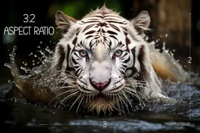
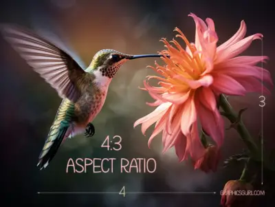
The most common aspect ratio for photographs is 3:2, the standard ratio for 35mm film cameras and most DSLRs. Other common ratios include 4:3 (used by many digital cameras), 1:1 (for square photos), and 16:9 (for widescreen images).
Art Prints
The aspect ratio for art prints can vary widely depending on the original work of art. However, some common aspect ratios include 1:1 (square), 2:3, 3:4, and 4:5.
Book Covers
The aspect ratio for book covers also varies depending on the book format.
- Most standard hardcover books have an aspect ratio of 3:2.
- Paperback books often have a slightly taller aspect ratio, around 1.5:1.
- Meanwhile, eBook covers typically have an aspect ratio of 1.6:1, the same as the Kindle’s display aspect ratio.
Posters
Standard movie posters often use a 2:3 aspect ratio. However, other common poster sizes, such as the ISO A series, have different aspect ratios. For example, an A2, A3, or A4 poster has an aspect ratio of 1:√2 (approximately 1:1.41).
Business Cards
The standard aspect ratio for business cards in the U.S. and Canada is 1.75:1. In many other countries, a slightly narrower aspect ratio of 1.43:1 is standard.
Magazine Covers
The aspect ratio for magazine covers can vary, but a typical ratio is 2:3.
Album Covers
Album covers, particularly for vinyl records and CDs, typically have a 1:1 aspect ratio, making them perfectly square.
Wrapping it Up
Mastering the correct aspect ratios for different screens, apps, and formats ensures your designs look their best and perform well, regardless of where they’re viewed or printed. Tailor your MidJourney images to the preferred aspect ratios of each platform or design format for optimal results and easier use!


How do you determine actual print sizes? 8×10, 12×10?
Hi Kyla,
I’ve developed an aspect ratio calculator that might be of use to you. It lets you enter the desired size (in inches or pixels) that you need and then gives you the aspect ratio to use in MidJourney.
https://graphicsgurl.com/midjourney-aspect-ratio-calculator/
Thanks for stopping by!