Recently, I’ve fallen in love with the Morandi color palette, subtle yet profound, drawing its inspiration from Giorgio Morandi. This color combination has become a hallmark of sophistication in the world of graphic design, offering a unique blend of muted earthy tones that evoke a sense of calm and understated elegance.
I decided to go all in and write a blog post about it. Let’s dig in!
Where It All Began: Who Was Giorgio Morandi?
Giorgio Morandi, an artist known for finding beauty in simplicity, is the genius behind this color palette. He was an Italian painter known for his tranquil and introspective still-life paintings with simplified forms and a muted color range. His paintings, often featuring bottles, bowls, and vases, showcase a mastery of portraying the quiet and mundane aspects of life with a profound sense of beauty.
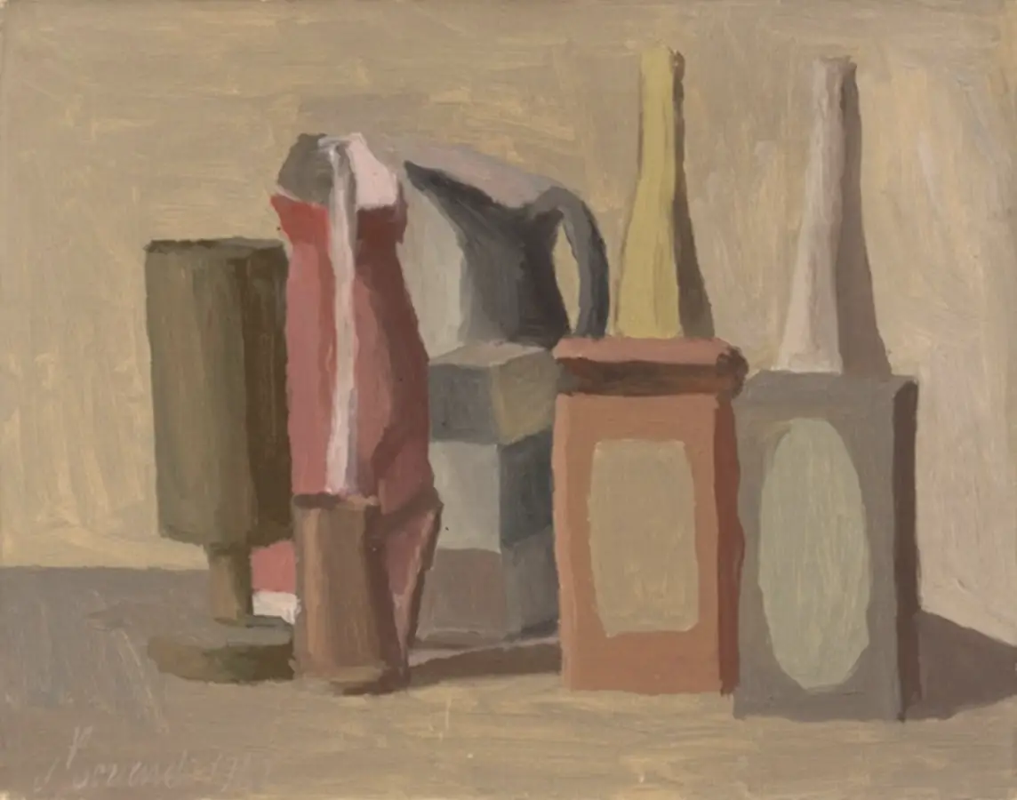
His art, focused on everyday objects, plays with light and shadow in the most minimalist way, setting the stage for these soothing colors. The Morandi color palette is a direct reflection of this artistic approach, capturing the essence of his work through its palette.
What Makes the Morandi Color Palette Special
Imagine desaturated hues like pastel blues, warm greys, soft beiges, and earthy browns, all with a touch of faded gray giving them a vintage vibe. This subtlety is the charm of the Morandi color palette; it doesn’t overpower but rather compliments, creating a harmonious blend that’s easy on the eyes. These colors are super versatile too, perfect for designs that need to be elegant without shouting for attention.
15 Popular Morandi Colors
The Morandi color palette, with its subtle and sophisticated hues, offers a wide range of options for designers. Let’s look at some of the most popular Morandi colors, complete with names, descriptions, and hex codes. Hopefully, this list of colors will help you use these hues in your future projects.
Coral
Hex Code: #FF7F50

A muted, pinkish-orange hue, Coral exudes warmth and a gentle energy. It’s perfect for adding a soft touch of color to designs without overwhelming other elements. Kind of similar to the 2024 Pantone color of the year?
Salmon
Hex Code: #FA8072

This is a pale, pinkish-orange shade, reminiscent of the fish it’s named after. Salmon brings a sense of freshness and lightness, ideal for creating inviting spaces.
Champagne
Hex Code: #F7E7CE

A sophisticated and neutral beige, Champagne is versatile and unobtrusive. It offers an elegant background or a subtle accent in various design contexts.
Pearl Gray
Hex Code: #DCD7D1

A light, soft gray with a hint of warmth. Pearl Gray is a go-to choice for creating a serene and balanced aesthetic.
Eucharis
Hex Code: #919b87

Named after a flower, Eucharis is a muted green with a touch of gray. It’s excellent for designs aiming to convey a sense of growth and tranquility.
Sophisticated Gray
Hex Code: #5a595e

A deeper gray that strikes a balance between being impactful and subdued. This color can anchor a design while maintaining the Morandi palette’s characteristic softness.
Tiffany Blue
Hex Code: #0ABAB5

A soft, muted turquoise that brings a refreshing and airy feel to designs. It’s elegant and soothing, perfect for creating a sense of calmness.
Burgundy Red
Hex Code: #800020

A deep, muted red with a touch of brown. This rich color adds depth and warmth, ideal for designs that aim to convey luxury and sophistication.
Klein Blue
Hex Code: #1635a2

A muted version of the intense original, offering a sense of depth and boldness without being overpowering. It’s great for adding a striking element to a design.
Olive Green
Hex Code: #a0ae8c

A subdued, earthy green with yellow undertones. Olive Green is versatile and natural, evoking stability and a connection to the natural world.
Ochre
Hex Code: #c07b37

A muted, earth-toned yellow, reminiscent of clay. Ochre adds a warm, organic touch, suitable for designs that aim to be comforting and grounded.
Rust
Hex Code: #9c431d

A deep, burnt red-orange that exudes warmth and a vintage feel. Rust is perfect for creating a rustic, cozy atmosphere in designs.
Dusty Pink
Hex Code: #d9b6b2

A soft, pale pink with gray undertones. This gentle color is ideal for adding a touch of femininity and softness to designs without being too bright.
Blue Haze
Hex Code: #a4b9ba

Blue Haze is a soft, ethereal shade of blue with a hint of gray, evoking the misty quality of a distant horizon or a serene morning sky. This color embodies tranquility and a sense of spaciousness, offering a breath of fresh air to any design.
Dry Rose
Hex Code: #834b59

Dry Rose is a muted, subtle shade of pink with a touch of earthy brown. This color exudes a vintage charm, reminiscent of faded roses and antique elegance bringing a quiet sophistication and a hint of old-world charm.
Free Download: Morandi Photoshop Color Palette
I put the colors above in a Photoshop color palette along with a few more Morandi colors – 42 in all. If you’d like to download it, head over to my shop and grab it: Photoshop Morandi Swatches It’s free!
The Feel-Good Factor
Colors play a crucial role in shaping our emotions and perceptions, and the Morandi palette is no exception. Morandi colors are like a breath of fresh air in the busy world of graphic design.
These hues tend to evoke feelings of calmness and serenity, making them perfect for designs that seek to create a peaceful and contemplative space, making them a go-to choice for designs related to wellness or relaxation.
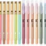
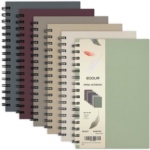
Personally, I think that Morandi’s colors are gorgeous and they evoke a sense of calm and happiness in me. I’m currently using Morandi color themes in my journal and planner. I’m seeing an increase in the use of subtle earthtone-colored markers, stickers, and stationery out in the marketplace too.
Using Morandi Colors Wisely
When you’re playing with these hues, think about the mood you’re aiming for. Mixing them with bold colors like deep blue, black, or rich green, creates a striking contrast while maintaining an elegant harmony.
And don’t forget the texture! A matte finish can make them even more subtle, while a glossy one adds a modern twist.
Tips for Color Research and Matching
When researching Morandi colors, use digital tools like color pickers and palette generators to find the exact shades. Websites and apps that offer color-matching services can be invaluable for accurately replicating these hues in various mediums.
You could also explore material swatches in print and textile shops for a tactile understanding of how these colors work in different materials.
Color Combinations
Here are some examples of effective color combinations:
- Light shades like Champagne or Pearl Gray with darker tones like Sophisticated Gray for contrast
- Warm colors like Coral or Salmon with cooler tones like Eucharis create a balanced and visually appealing design
- Tiffany Blue with Ochre create a refreshing and earthy palette
- Dusty Pink with Olive Green offers a delicate and natural look
Morandi colors can be used in various design projects, from branding and web design to interior decorating and fashion, providing a touch of understated elegance. Let’s look at some specific examples next.
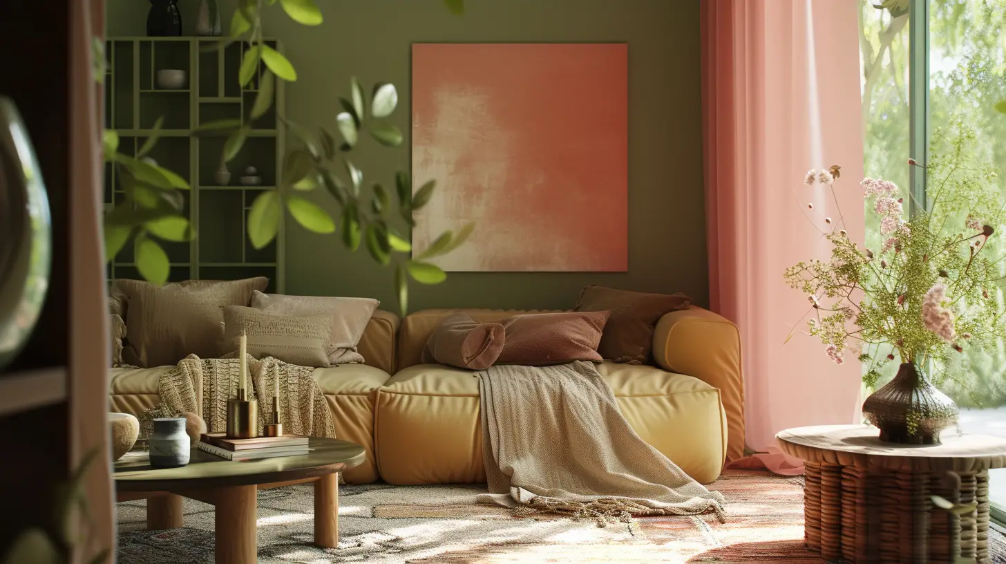
Morandi Color Palette in Today’s Design World
In the realm of modern graphic design, the Morandi color scheme has emerged as a popular choice, celebrated for its understated elegance and versatility. The effectiveness of these colors is evident across different design mediums – from print, where the tactile quality of materials can be accentuated by such hues, to digital platforms, where they create a serene visual experience.
You’ll even find them in environmental graphics, where they harmonize effortlessly with surrounding elements. In fact, the adaptability of the Morandi color palette is remarkable, extending its influence across many different industries, for example:
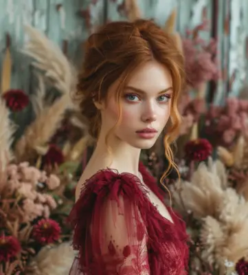
Fashion Industry: these colors lend a timeless elegance to garments and accessories.
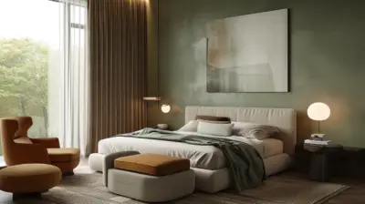
Interior Design: the use of shades like pearl gray and champagne creates serene and sophisticated spaces.
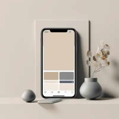
UI/UX Design: you’ll find that these earthtone colors increase readability and the user experience is enhanced by their muted yet inviting tones.
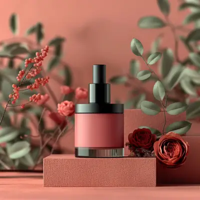
Branding & Packaging: Morandi colors like coral and salmon are increasingly being chosen to convey a sense of sophistication and quality. These colors, with their humble elegance, create a brand identity that stands out for its refined subtlety.
Challenges? No Problem!
Integrating the Morandi color palette into design projects offers a unique set of challenges and considerations. Let’s explore a few of these challenges and some practical solutions for designers to navigate them.
Common Design Challenges
- Balancing Subtlety with Vibrancy: One of the main challenges with Morandi colors is finding the right balance with more vibrant hues. These muted tones can sometimes be overshadowed by bolder colors, leading to a lack of harmony in the design.
- Avoiding Monotony: Given their muted nature, there’s a risk that the Morandi color palette could make a design appear washed-out or monotonous. Ensuring that these colors contribute to a dynamic and engaging design requires careful consideration.
- Print Reproduction: Reproducing Morandi colors in print can be challenging due to their subtlety. It’s important to ensure that the final printed product accurately reflects the intended hues.
Solutions and Best Practices
- Strategic Color Balancing: To create a harmonious design, use Morandi colors as a foundation and accentuate them with brighter colors for contrast. For instance, pairing a muted olive green with a vibrant burgundy can create an appealing contrast while maintaining a sophisticated palette.
- Incorporating Textures and Complementary Colors: Introducing varying textures and complementary colors can prevent monotony. Using materials like matte paper or fabric can enhance the tactile experience and add depth to the design. Complementary colors, when used sparingly, can bring life to the muted Morandi hues.
- Collaboration in Print Reproduction: Work closely with printers to ensure accurate color reproduction. It’s beneficial to conduct color tests and proofing on the intended printing material to see how the colors translate from screen to print.
- Cultural and Psychological Implications: Be aware of the cultural and emotional impact of color choices. Different colors can evoke various emotions and may have different meanings in different cultures.
- Staying Trend-Aware: While it’s important to follow color trends, the timeless appeal of the Morandi color palette should not be overlooked. They can be adapted to contemporary designs while still retaining their classic elegance.
Sure, working with Morandi colors can have tricky moments. But with some smart balancing, you can make these colors shine in your designs.
Wrapping It Up
The Morandi color palette stands as a testament to the power of color in shaping our visual experiences. It’s your secret weapon for creating designs that are both sophisticated and soothing – a timeless choice in the ever-evolving world of graphic design that’ll keep your work standing out in the best way possible.
What’s your favorite color palette? Let me know in the comments!